Posted by matthew on Sep 25, 2009 in
dance Lotte decided I needed to run a DJ workshop, so over the past few weeks I’ve been chatting to DJs around Melbourne about the idea. The response was pretty positive, so I decided to put some time into designing one. I realised it would need to be more than a one-off workshop, so it’s going to be a 3 week course, starting on Monday October the 19th at 7pm. So if you’re interested in becoming a swing DJ, or you’re already getting gigs and just want to become an outstanding DJ, download the flyer below. Since I will be putting some resources online, you’ll need to enrol beforehand by sending me an email at matthew@matthewriddle.com.
DJ Masterclass Flyer [PDF, 102K]
Posted by matthew on Sep 18, 2009 in
education,
technology 
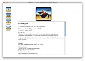
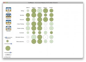
Since downloading revMedia a couple of weeks ago (see previous post), my little project has turned into something that I hope will be quite useful. I’ve written an application (in the end using Revolution Studio) that creates heat maps! It’s called GradMapper, and this is what it looks like:

The project I’m working on is about curriculum mapping. The problem is to get a picture of where students are exposed to various generic skills (or ‘graduate capabilities’) like writing, speaking, critical thinking, team work, and so on across a program of study. A heat map allows information in a couple of different categories to be combined in one two dimensional map, through the use of colour/shade as well as size. The columns are subjects, the size of the bubbles represents how much something is taught, and the intensity of the colour represents how confident we are with the evidence. I took a look at what kind of software was out there to create this kind of a diagram, and realised it was reasonably easy to create something with off the shelf packages like Excel, but it was difficult to really customise the look of the graphs or create a workflow to suit the task.

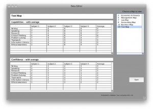
I realised that I really wanted to be able to create a simple table of data, look at the map, and save it online, without dealing with uploading/downloading every time. I wanted to be able to click a menu and compare two graphs from two different programs, overlay them if necessary, and share the data with someone somewhere else. After mucking around with Revolution for a while I realised it was going to be easier to write my own application, and that other people might want to use it as well. What’s more, it would be much easier to share the methodology we developed for our project if there was a tool like this to support it. The Data Entry screen above is where the tables are entered. Clicking on the list of Maps on the right selects a map. The application uses MySQL to store the map data, and draws the maps as you go. It’s working really well now, and I’m adding new features daily. The next version will have the ability to overlay multiple maps for comparisons. And yes, it will be available for Mac and Windows — I will probably also post an online test version here using the revWeb plugin when it becomes a bit more stable. If you’re interested in being a beta tester, please let me know.
